
What is "Float"?
Float is a CSS positioning property. To understand its purpose and origin, we can look to print design. In a print layout, images may be set into the page such that text wraps around them as needed. This is commonly and appropriately called "text wrap". Here is an example of that.
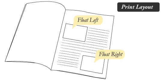
In page layout programs, the boxes that hold the text can be told to honor the text wrap, or to ignore it. Ignoring the text wrap will allow the words to flow right over the image like it wasn't even there. This is the difference between that image being part of the flow of the page (or not). Web design is very similar.
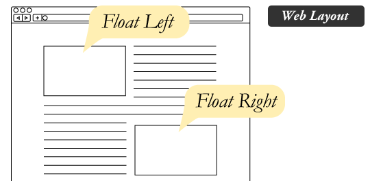
In web design, page elements with the CSS float property applied to them are just like the images in the print layout where the text flows around them. Floated elements remain a part of the flow of the web page. This is distinctly different than page elements that use absolute positioning. Absolutely positioned page elements are removed from the flow of the webpage, like when the text box in the print layout was told to ignore the page wrap. Absolutely positioned page elements will not affect the position of other elements and other elements will not affect them, whether they touch each other or not.
Setting the float on an element with CSS happens like this:

There are four valid values for the float property. Left and Right float elements those directions respectively. None (the default) ensures the element will not float and Inherit which will assume the float value from that elements parent element.
#What are floats used for?
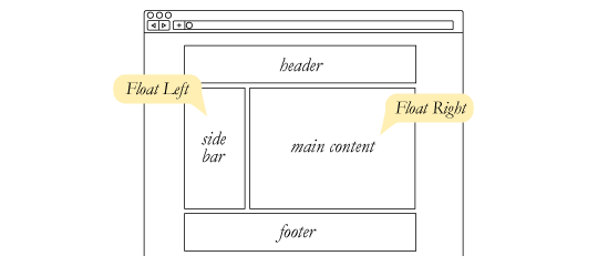
Aside from the simple example of wrapping text around images, floats can be used to create entire web layouts.
Floats are also helpful for layout in smaller instances. Take for example this little area of a web page. If we use float for our little avatar image, when that image changes size the text in the box will reflow to accommodate:
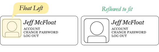
This same layout could be accomplished using relative positioning on container and absolute positioning on the avatar as well. In doing it this way, the text would be unaffected by the avatar and not be able to reflow on a size change.
Clearing the Float
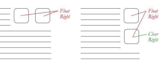
Float's sister property is clear. An element that has the clear property set on it will not move up adjacent to the float like the float desires, but will move itself down past the float. Again an illustration probably does more good than words do.
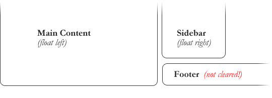
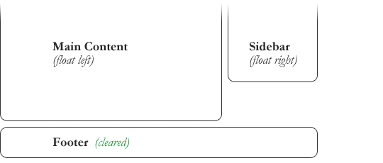
In the above example, the sidebar is floated to the right and is shorter than the main content area. The footer then is required to jump up into that available space as is required by the float. To fix this problem, the footer can be cleared to ensure it stays beneath both floated columns.

Clear has four valid values as well. Both is most commonly used, which clears floats coming from either direction. Left and Right can be used to only clear the float from one direction respectively. None is the default, which is typically unnecessary unless removing a clear value from a cascade. Inherit would be the fifth, but is strangely not supported in Internet Explorer. Clearing only the left or right float, while less commonly seen in the wild, definitely has its uses.
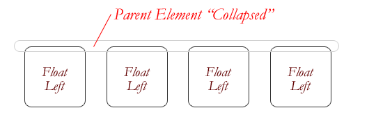
The Great Collapse
One of the more bewildering things about working with floats is how they can affect the element that contains them (their "parent" element). If this parent element contained nothing but floated elements, the height of it would literally collapse to nothing. This isn't always obvious if the parent doesn't contain any visually noticeable background, but it is important to be aware of.
As anti-intuitive as collapsing seems to be, the alternative is worse. Consider this scenario:

If the block element on top were to have automatically expanded to accommodate the floated element, we would have an unnatural spacing break in the flow of text between paragraphs, with no practical way of fixing it. If this were the case, us designers would be complaining much harder about this behavior than we do about collapsing.
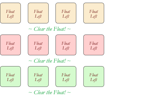
Collapsing almost always needs to be dealt with to prevent strange layout and cross-browser problems. We fix it by clearing the float after the floated elements in the container but before the close of the container.
Techniques for Clearing Floats
If you are in a situation where you always know what the succeeding element is going to be, you can apply the clear: both; value to that element and go about your business. This is ideal as it requires no fancy hacks and no additional elements making it perfectly semantic. Of course things don't typically work out that way and we need to have more float-clearing tools in our toolbox.
- The Empty Div Method is, quite literally, an empty div. <div style="clear: both;"></div>. Sometimes you'll see a <br> element or some other random element used, but div is the most common because it has no browser default styling, doesn't have any special function, and is unlikely to be generically styled with CSS. This method is scorned by semantic purists since its presence has no contextual meaning at all to the page and is there purely for presentation. Of course in the strictest sense they are right, but it gets the job done right and doesn't hurt anybody.
- The Overflow Method relies on setting the overflow CSS property on a parent element. If this property is set to auto or hidden on the parent element, the parent will expand to contain the floats, effectively clearing it for succeeding elements. This method can be beautifully semantic as it may not require an additional elements. However if you find yourself adding a new div just to apply this, it is equally as non-semantic as the empty div method and less adaptable. Also bear in mind that the overflow property isn't specifically for clearing floats. Be careful not to hide content or trigger unwanted scrollbars.
- The Easy Clearing Method uses a clever CSS pseudo selector (:after) to clear floats. Rather than setting the overflow on the parent, you apply an additional class like "clearfix" to it. Then apply this CSS:

This will apply a small bit of content, hidden from view, after the parent element which clears the float. This isn't quite the whole story, as additional code needs to be used to accomodate for older browsers.
Different scenarios call for different float clearing methods. Take for example a grid of blocks, each of different types.
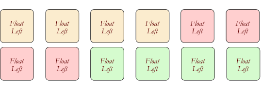
To better visually connect the similar blocks, we want to start a new row as we please, in this case when the color changes. We could use either the overflow or easy clearing method if each of the color groups had a parent element. Or, we use the empty div method in between each group. Three wrapping divs that didn't previously exist or three after divs that didn't previously exist. I'll let you decide which is better.
Problems with Floats
Floats often get beat on for being fragile. The majority of this fragility comes from IE 6 and the slew of float-related bugs it has. As more and more designers are dropping support for IE 6, you may not care, but for the folks that do care here is a quick rundown.
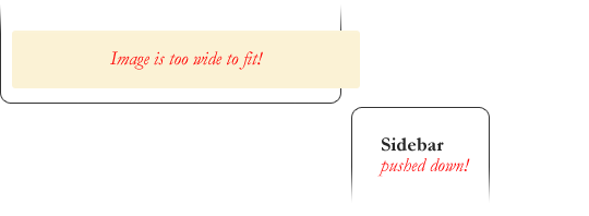
Pushdown is a symptom of an element inside a floated item being wider than the float itself (typically an image). Most browsers will render the image outside the float, but not have the part sticking out affect other layout. IE will expand the float to contain the image, often drastically affecting layout. A common example is an image sticking out of the main content push the sidebar down below.
Quick fix: Make sure you don't have any images that do this, use overflow: hidden to cut off excess.
- Double Margin Bug - Another thing to remember when dealing with IE 6 is that if you apply a margin in the same direction as the float, it will double the margin. Quick fix: set display: inline on the float, and don't worry it will remain a block-level element.
- The 3px Jog is when text that is up next to a floated element is mysteriously kicked away by 3px like a weird forcefield around the float. Quick fix: set a width or height on the affected text.
- In IE 7, the Bottom Margin Bug is when if a floated parent has floated children inside it, bottom margin on those children is ignored by the parent. Quick fix: using bottom padding on the parent instead.
Alternatives
If you need text wrapping around images, there really aren't any alternatives for float. Speaking of which, check out this rather clever technique for wrapping text around irregular shapes. But for page layout, there definitely are choices. Eric Sol right here on A List Apart has an article on Faux Absolute Positioning, which is a very interesting technique that in many ways combines the flexibility of floats with the strength of absolute positioning. CSS3 has the Template Layout Module that, when widely adopted, will prove to be the page layout technique of choice.
Video
I did a screencast a while back explaining many of these float concepts.
SOURCE: https://css-tricks.com/all-about-floats/
_______________
Positioning Content
One of the best things about CSS is that it gives us the ability to position content and elements on a page in nearly any imaginable way, bringing structure to our designs and helping make content more digestible.
There are a few different types of positioning within CSS, and each has its own application. In this chapter we’re going to take a look at a few different use cases—creating reusable layouts and uniquely positioning one-off elements—and describe a few ways to go about each.
Positioning with Floats
One way to position elements on a page is with the float property. The float property is pretty versatile and can be used in a number of different ways.
Essentially, the float property allows us to take an element, remove it from the normal flow of a page, and position it to the left or right of its parent element. All other elements on the page will then flow around the floated element. An <img> element floated to the side of a few paragraphs of text, for example, will allow the paragraphs to wrap around the image as necessary.
When the float property is used on multiple elements at the same time, it provides the ability to create a layout by floating elements directly next to or opposite each other, as seen in multiple-column layouts.
The float property accepts a few values; the two most popular values are left and right, which allow elements to be floated to the left or right of their parent element.

Floats in Practice
Let’s create a common page layout with a header at the top, two columns in the center, and a footer at the bottom. Ideally this page would be marked up using the <header>, <section>, <aside>, and <footer> elements as discussed in Lesson 2, “Getting to Know HTML.” Inside the <body> element, the HTML may look like this:


Here the <section> and <aside> elements, as block-level elements, will be stacked on top of one another by default. However, we want these elements to sit side by side. By floating the <section> to the left and the <aside> to the right, we can position them as two columns sitting opposite one another. Our CSS should look like this:

For reference, when an element is floated, it will float all the way to the edge of its parent element. If there isn’t a parent element, the floated element will then float all the way to the edge of the page.
When we float an element, we take it out of the normal flow of the HTML document. This causes the width of that element to default to the width of the content within it. Sometimes, such as when we’re creating columns for a reusable layout, this behavior is not desired. It can be corrected by adding a fixed width property value to each column. Additionally, to prevent floated elements from touching one another, causing the content of one to sit directly next to the content of the other, we can use the margin property to create space between elements.
Here, we are extending the previous code block, adding a margin and width to each column to better shape our desired outcome.


With two columns we can float one column to the left and another to the right, but with more columns we must change our approach. Say, for example, we’d like to have a row of three columns between our <header> and <footer> elements. If we drop our <aside> element and use three <section> elements, our HTML might look like this:

To position these three <section> elements in a three-column row, instead of floating one column to the left and one column to the right, we’ll float all three <section> elements to the left. We’ll also need to adjust the width of the <section> elements to account for the additional columns and to get them to sit one next to the other.

Here we have three columns, all with equal width and margin values and all floated to the left.

Clearing & Containing Floats
The float property was originally designed to allow content to wrap around images. An image could be floated, and all of the content surrounding that image could then naturally flow around it. Although this works great for images, the float property was never actually intended to be used for layout and positioning purposes, and thus it comes with a few pitfalls.
One of those pitfalls is that occasionally the proper styles will not render on an element that it is sitting next to or is a parent element of a floated element. When an element is floated, it is taken out of the normal flow of the page, and, as a result, the styles of elements around that floated element can be negatively impacted.
Often margin and padding property values aren’t interpreted correctly, causing them to blend into the floated element; other properties can be affected, too.
Another pitfall is that sometimes unwanted content begins to wrap around a floated element. Removing an element from the flow of the document allows all the elements around the floated element to wrap and consume any available space around the floated element, which is often undesired.
With our previous two-column example, after we floated the <section> and <aside> elements, and before we set a width property value on either of them, the content within the <footer> element would have wrapped in between the two floated elements above it, filling in any available space. Consequently, the <footer> element would have sat in the gutter between the <section> and <aside> elements, consuming the available space.

To prevent content from wrapping around floated elements, we need to clear, or contain, those floats and return the page to its normal flow. We’ll proceed by looking at how to clear floats, and then we’ll take a look at how to contain floats.
Clearing Floats
Clearing floats is accomplished using the clear property, which accepts a few different values: the most commonly used values being left, right, and both.

The left value will clear left floats, while the right value will clear right floats. The both value, however, will clear both left and right floats and is often the most ideal value.
Going back to our previous example, if we use the clear property with the value of both on the <footer> element, we are able to clear the floats. It is important that this clear be applied to an element appearing after the floated elements, not before, to return the page to its normal flow.


Containing Floats
Rather than clearing floats, another option is to contain the floats. The outcomes of containing floats versus those of clearing them are nearly the same; however, containing floats does help to ensure that all of our styles will be rendered properly.
To contain floats, the floated elements must reside within a parent element. The parent element will act as a container, leaving the flow of the document completely normal outside of it. The CSS for that parent element, represented by the group class below, is shown here:

There’s quite a bit going on here, but essentially what the CSS is doing is clearing any floated elements within the element with the class of group and returning the flow of the document back to normal.
More specifically, the :before and :after pseudo-elements, as mentioned in the Lesson 4 exercise, are dynamically generated elements above and below the element with the class of group. Those elements do not include any content and are displayed as table-level elements, much like block-level elements. The dynamically generated element after the element with the class of group is clearing the floats within the element with the class of group, much like the clear from before. And lastly, the element with the class of group itself also clears any floats that may appear above it, in case a left or right float may exist. It also includes a little trickery to get older browsers to play nicely.
It is more code than the clear: both; declaration alone, but it can prove to be quite useful.
Looking at our two-column page layout from before, we could wrap the <section> and <aside> elements with a parent element. That parent element then needs to contain the floats within itself. The code would look like this:
HTML

CSS


The technique shown here for containing elements is know as a “clearfix” and can often be found in other websites with the class name of clearfix or cf. We’ve chosen to use the class name of group, though, as it is representing a group of elements, and better expresses the content.
As elements are floated, it is important to keep note of how they affect the flow of a page and to make sure the flow of a page is reset by either clearing or containing the floats as necessary. Failing to keep track of floats can cause quite a few headaches, especially as pages begin to have multiple rows of multiple columns.
In Practice
Let’s return to the Styles Conference website to try floating some content.
1. First things first, before we begin floating any elements, let’s provide a way to contain those floats by adding the clearfix to our CSS. Within the main.css file, just below our grid styles, let’s add the clearfix under the class name group, just like before.

2. Now that we can contain floats, let’s float the primary <h1> within the <header> element to the left and allow all of the other content in the header to wrap to the right of it.
To do this, let’s add a class of logo to the <h1> element. Then within our CSS, let’s add a new section of styles for the primary header. In this section we’ll select the <h1> element with the logo class and then float it to the left.
HTML

CSS

3. While we’re at it, let’s add a little more detail to our logo. We’ll begin by placing a <br> element, or line break, between the word “Styles” and the word “Conference” to force the text of our logo to sit on two lines.
Within the CSS, let’s add a border to the top of our logo and some vertical padding to give the logo breathing room.
HTML

CSS

4. Because we floated the <h1> element, we’ll want to contain that float. The closest parent element of the <h1> element is the <header> element, so we’ll want to add the class of group to the <header> element. Doing this applies the clearfix styles we set up earlier to the <header> element.

5. The <header> element is taking shape, so let’s take a look at the <footer> element. Much like we did with the <header> element, we’ll float our copyright to the left within the <small> element and let all other elements wrap around it to the right.
Unlike the <header> element, though, we’re not going to use a class directly on the floated element. This time we’re going to apply a class to the parent of the floated element and use a unique CSS selector to select the element and then float it.
Let’s start by adding the class of primary-footer to the <footer> element. Because we know we’ll be floating an element within the <footer> element, we should also add the class of group while we’re at it.

6. Now that the class of primary-footer is on the <footer> element, we can use that class to prequalify the <small> element with CSS. We’ll want to select and float the <small> element to the left. Let’s not forget to create a new section within our main.css file for these primary footer styles.

To review, here we are selecting the <small> element, which must reside within an element with the class attribute value of primary-footer, such as our <footer> element, for example.
Lastly, let’s put some padding on the top and bottom of the <footer> element to help separate it a little more from the rest of the page. We can do this directly by using the primary-footer class with a class selector.

With all of these changes to the <header> and <footer> elements, we have to be sure to make them on every page, not just the index.html page.

Fig 5.01
With a few floats, the <header> and <footer> elements on our Styles Conference home page are coming together
Positioning with Inline-Block#inline-block
In addition to using floats, another way we can position content is by using the display property in conjunction with the inline-block value. The inline-block method, as we’ll discuss, is primarily helpful for laying out pages or for placing elements next to one another within a line.
Recall that the inline-block value for the display property will display elements within a line while allowing them to accept all box model properties, including height, width, padding, border, and margin. Using inline-block elements allows us to take full advantage of the box model without having to worry about clearing any floats.
Inline-Block in Practice
Let’s take a look at our three-column example from before. We’ll start by keeping our HTML just as it is:

Now instead of floating our three <section> elements, we’ll change their display values to inline-block, leaving the margin and width properties from before alone. Our resulting CSS will look like this:

Unfortunately, this code alone doesn’t quite do the trick, and the last <section> element is pushed to a new row. Remember, because inline-block elements are displayed on the same line as one another, they include a single space between them. When the size of each single space is added to the width and horizontal margin values of all the elements in the row, the total width becomes too great, pushing the last <section> element to a new row. In order to display all of the <section> elements on the same row, the white space between each <section> element must be removed.
Inline-Block Elements with White Space Demo

Removing Spaces Between Inline-Block Elements
There are a number of ways to remove the space between inline-block elements, and some are more complex than others. We are going to focus on two of the easiest ways, both of which happen inside HTML.
The first solution is to put each new <section> element’s opening tag on the same line as the previous <section> element’s closing tag. Rather than using a new line for each element, we’ll end and begin elements on the same line. Our HTML could look like this:

Writing inline-block elements this way ensures that the space between inline-block elements within HTML doesn’t exist; consequently, the space will not appear when the page is rendered.

Another way to remove the white space between inline-block elements is to open an HTML comment directly after an inline-block element’s closing tag. Then, close the HTML com- ment immediately before the next inline-block element’s opening tag. Doing this allows inline-block elements to begin and end on separate lines of HTML and “comments out” any potential spaces between the elements. The resulting code would look like this:

Neither of these options is perfect, but they are helpful. I tend to favor using comments for better organization, but which option you choose is entirely up to you.
Creating Reusable Layouts
When building a website, it is always best to write modular styles that may be reused elsewhere, and reusable layouts are high on the list of reusable code. Layouts can be created using either floats or inline-block elements, but which works best and why?
Whether it’s better to use floats or inline-block elements to lay out the structure of a page is open to debate. My approach is to use inline-block elements to create the grid—or layout—of a page and to then use floats when I want content to wrap around a given element (as floats were intended to do with images). Generally, I also find inline-block elements easier to work with.
That said, use whatever works best for you. If you are comfortable with one approach over the other, then go for it.
Currently there are new CSS specifications in the works—specifically flex- and grid- based properties—that will help address how to best lay out pages. Keep an eye out for these methods as they begin to surface.
In Practice
With a solid understanding of reusable layouts, the time has come to implement one in our Styles Conference website.
1. For the Styles Conference website, we’ll create a three-column reusable layout using inline-block elements. We’ll do so in a way that allows us to have three columns of equal width or two columns with the total width split between them, two-thirds in one and one-third in the other.
To begin, we’ll create classes that define the width of these columns. The two classes we’ll create are col-1-3, for one-third, and col-2-3, for two-thirds. Within the grid section of our main.css file, let’s go ahead and define these classes and their corresponding widths.

2. We’ll want both of the columns to be displayed as inline-block elements. We’ll need to make sure that their vertical alignment is set to the top of each column, too.
Let’s create two new selectors that will share the display and vertical-alignment property styles.

Looking at the CSS again, we’ve created two class selectors, col-1-3 and col-2-3, that are separated with a comma. The comma at the end of the first selector signifies that another selector is to follow. The second selector is followed by the opening curly bracket, {, which signifies that style declarations are to follow. By comma-separating the selectors, we can bind the same styles to multiple selectors at one time.
3. We’ll want to put some space in between each of the columns to help break up the content. We can accomplish this by putting horizontal padding on each of the columns.
This works well; however, when two columns are sitting next to one another, the width of the space between them will be double that of the space from the outside columns to the edge of the row. To balance this we’ll place all of our columns within a grid and add the same padding from our columns to that grid.
Let’s use a class name of grid to identify our grid, and then let’s identify the same horizontal padding for our grid, col-1-3, and col-2-3 classes. With commas separating our selectors again, our CSS looks like this:

4. When we’re setting up the horizontal padding, we’ll need to be careful. Remember, in the last lesson we created a container element, known by the class of container, to center all of our content on a page within a 960-pixel-wide element. Currently if we were to put an element with the class of grid inside an element with the class of container, their horizontal paddings would add to one another, and our columns would not appear proportionate to the width of the rest of the page.
We don’t want this to happen, so instead, we’ll have to share some of the styles from the container rule set with the grid rule set. Specifically, we’ll need to share the width property and values (to make sure our page stays fixed at 960 pixels wide) and the margin property and values (to center any element with the class of grid on the page).
We’ll accomplish this by breaking up the old container rule set into the following:

Now any element with the class of container or grid will be 960 pixels wide and centered on the page. Additionally, we’ve preserved the existing horizontal padding for any element with the class of container by moving it into a new, separate rule set.
5. All right—all of the heavy lifting needed to get our reusable grid styles into place is finished. Now it’s time to work in our HTML and to see how these classes perform.
We’ll begin with the teasers on the home page, within our index.html file, aligning them into three columns. Currently, the teasers are wrapped in a <section> element with the class of container. We’ll want to change that class from container to grid so that we can begin placing columns within it.

Next, we’ll want to add a class of col-1-3 to each of the <section> elements within the <section> element with the class of grid.

7. And lastly, because each of our columns is an inline-block element, we’ll want to make sure we remove the empty white space between them. We’ll use comments to do this, and we’ll add a little bit of documentation noting each upcoming section while we’re at it to better organize our code.

To review, on line 3 we leave a comment identifying the “Speakers” section to follow. At the end of line 7, we open a comment immediately after the closing </section> tag. Within that comment, on line 9 we identify the “Schedule” section to come. We then close the comment at the beginning of line 11, just before the opening <section> tag. This same comment structure reappears on lines 13 through 17 between the two <section> elements, right before the “Venue” section. In all, we’ve commented out any potential white space between the columns while also using those comments to identify our sections.
We now have a reusable three-column grid that supports multiple arrangements, using both one-third- and two-thirds-width columns. Our home page now has three columns, breaking up all the different teasers.

Fig 5.02
Our Styles Conference home page now includes a three-column layout
Demo & Source Code
Below you may view the Styles Conference website in its current state, as well as download the source code for the website in its current state.
 or Download The Source Code (Zip File)
Uniquely Positioning Elements
Every now and then we’ll want to precisely position an element, but floats or inline-block elements won’t do the trick. Floats, which remove an element from the flow of a page, often produce unwanted results as surrounding elements flow around the floated element. Inline-block elements, unless we’re creating columns, can be fairly awkward to get into the proper position. For these situations we can use the position property in connection with box offset properties.
The position property identifies how an element is positioned on a page and whether or not it will appear within the normal flow of a document. This is used in conjunction with the box offset properties—top, right, bottom, and left—which identify exactly where an element will be positioned by moving elements in a number of different directions.
By default every element has a position value of static, which means that it exists in the normal flow of a document and it doesn’t accept any box offset properties. The static value is most commonly overwritten with a relative or absolute value, which we’ll examine next.
Relative Positioning
The relative value for the position property allows elements to appear within the normal flow a page, leaving space for an element as intended while not allowing other elements to flow around it; however, it also allows an element’s display position to be modified with the box offset properties. For example, consider the following HTML and CSS:
HTML

CSS


Here the second <div> element, the element with the class of offset, has a position value of relative and two box offset properties, left and top. This preserves the original position of the element, and other elements are not allowed to move into this space. Additionally, the box offset properties reposition the element, pushing it 20 pixels from the left and 20 pixels from the top of its original location.
With relatively positioned elements, it’s important to know that the box offset properties identify where an element will be moved from given its original position. Thus, the left property with a value of 20 pixels will actually push the element towards the right, from the left, 20 pixels. The top property with a value of 20 pixels, then, will push an element towards the bottom, from the top, 20 pixels.
When we position the element using the box offset properties, the element overlaps the element below it rather than moving that element down as the margin or padding properties would.
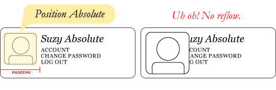
Absolute Positioning
The absolute value for the position property is different from the relative value in that an element with a position value of absolute will not appear within the normal flow of a document, and the original space and position of the absolutely positioned element will not be preserved.
Additionally, absolutely positioned elements are moved in relation to their closest relatively positioned parent element. Should a relatively positioned parent element not exist, the absolutely positioned element will be positioned in relation to the <body> element. That’s quite a bit of information; let’s take a look at how this works inside some code:
HTML

CSS


In this example the <section> element is relatively positioned but doesn’t include any box offset properties. Consequently its position doesn’t change. The <div> element with a class of offset includes a position value of absolute. Because the <section> element is the closest relatively positioned parent element to the <div> element, the <div> element will be positioned in relation to the <section> element.
With relatively positioned elements, the box offset properties identify in which direction an element would be moved in relation to itself. With absolutely positioned elements, the box offset properties identify in which direction an element will be moved in relation to its closest relatively positioned parent element.
As a result of the right and top box offset properties, the <div> element will appear 20 pixels from the right and 20 pixels from the top of the <section>.
Because the <div> element is absolutely positioned, it does not sit within the normal flow of the page and will overlap any surrounding elements. Additionally, the original position of the <div> is not preserved, and other elements are able to occupy that space.
Typically, most positioning can be handled without the use of the position property and box offset properties, but in certain cases they can be extremely helpful.
Summary
Learning how to position content within HTML and CSS is a huge step toward mastering the two languages. Add to this the box model, and we’re well on our way to becoming front-end developers.
To review, within this lesson we covered the following:
What floats are and how to use them to position content
How to clear and contain floated elements
How to position content with inline-block elements
How to remove the white space between inline-block elements
How to uniquely position content with relatively and absolutely positioned elements
We’re adding new skills with each lesson, so let’s keep going. Next up, typography!
SOURCE: https://learn.shayhowe.com/html-css/positioning-content/#reusable-layouts

0 comments:
Post a Comment