SOURCE: https://www.youtube.com/watch?v=DLhifkuPgL0
In part one and part two of this lecture, we were able to create the HTML and the CSS styling to lay out our single category menu items page. In this lecture, we're going to address the variability of the data that we display, through using the grid that we created, in the previous parts. Now before we declare a victory over this page here, let's go ahead and add, a whole bunch of these items inside the page. So, here's one, all the way down here. And let's copy that. And let's just make a space. That's going to be number 3. That's going to be number 4, number 5, and number 6. I think that's pretty much enough.
Okay, so let's number them properly here.
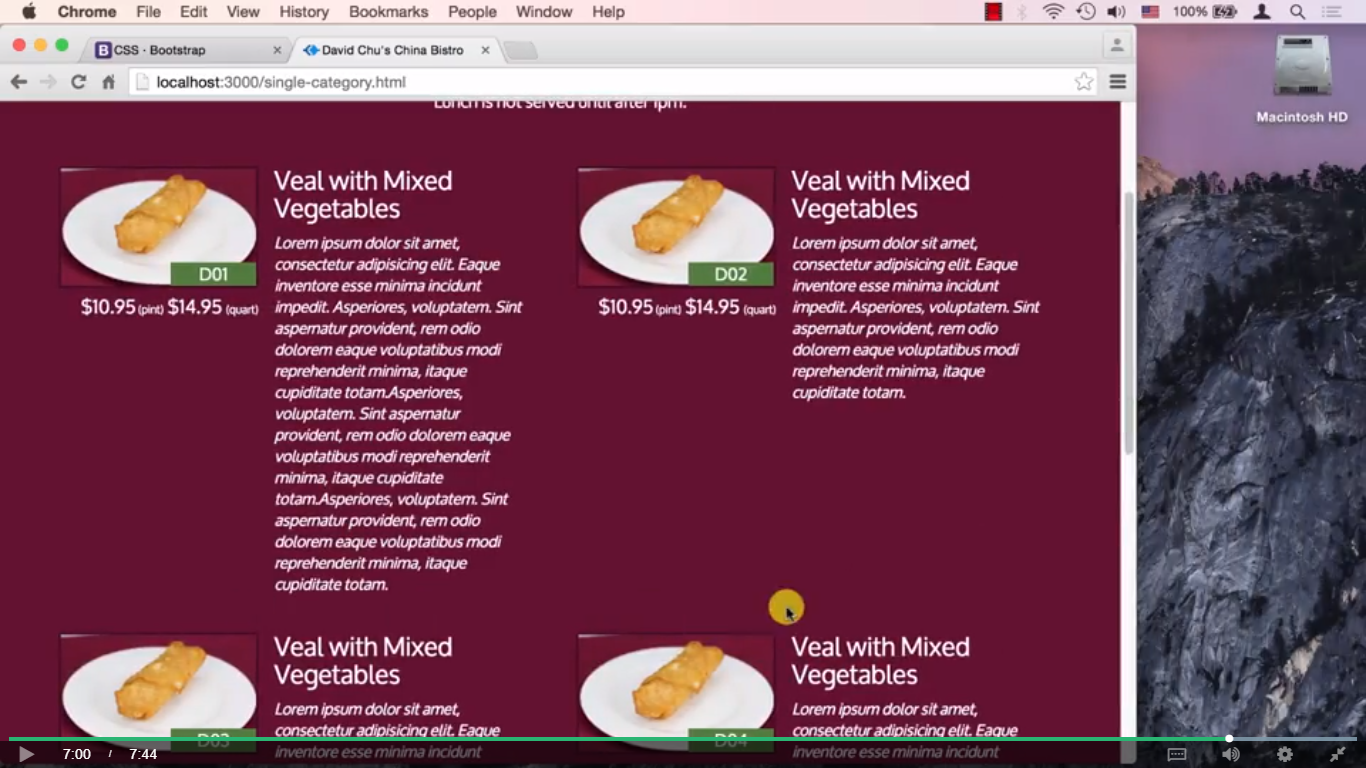
Let's go all the way to the top here. And the first item is D01, then the second item is going to be D02, the third item is going to be D03 and the fourth item is going to be D04, then D05, then finally D06 right here. So if we save that, go back to our browser, we can see they are very nicely aligned, the menu items are very nicely sitting here. So if we squeeze the browser, let's see if they all align very nicely. Yup. They're all nicely aligning, and finally collapsing nicely, as well. If we collapse all the way to the smallest screen, extra small, so they're all nicely collapsing all the way through. Even we can see our footer that we did before. Okay. One thing to test, and this is a very good thing to test whenever you have content that you really have no control over. In other words I really have no control to how large this description is going to be. It's very possible the description is going to be pretty short, maybe this description will be pretty long and, I don't know what. What happens when the description gets taller than what my kind of row, or this imaginary right now looks like? Well, I'm not sure what's going to happen. Let's take a look. So let's make, like for example, the very first item's description much bigger. So let's go back to our code editor, let's go back to number one item in our menu, right here. And let's just copy and paste this a couple of times. Copy and paste the description a couple of times. And save that, let's go back to our browser.
And take a look. Number 3 is now kind of been pushed all the way to the side. It really should've been sitting right here. Number 3 should've been sitting right here. Number 4 should've been still in the second row. So things are kind of messed up. So how do we take care of this problem? Well there's a couple of ways of taking care of it. Number one is you could restrict what this text field is going to be like. In other words you could say that only so many characters this is allowed to be or we're going to cut it off. We're basically just going to clip whatever it is that doesn't fit in here according to our specifications. Now this is a pretty rigid approach, and it's kind of hard to come up to the business owner, to the restaurant owner and say well, your descriptions can't be longer than this. Even though it's really actually a good idea to kind of make them nice and tight, nobody wants to read very long descriptions. But the same time, if our layout is now dictating to us, how large a particular description of a menu item is going to be, that sounds a little strange. So when instead what we can do, is we could fix this whole layout problem. Now why is this layout problem even happening to begin with? Well, as you remember, the grid layout in the Bootstrap, at least in the current version, is based on floating elements. So all these elements are being floated to the left. Well, what happens when element floated to the left, and something in the front of it kind of gets too long. Well, it kind of starts wrapping. Now it can't really fit in this row because its, you know, there's things protruding over here. So the very next spot that it could fit is right here. And then this number 4 element tries to float to the left of this, and it can't because there's no more room. So it goes to the next line.
If you go back and review the lecture on floats, this is something that we dealt with, and remember the clear property. And this is basically what we're going to need to do here. Except Bootstrap, prebaked, in its grid system, a special clear fix, that kind of takes care of these problems. So if we go to the Bootstrap website, and right now, we're in the grid system portion of it. You could see here it says, responsive column resets. Well what this is referring to is this specific problem, where one column becomes bigger and the rest of the columns kind of get messed up. And it's telling you here in order to fix that you need to add another div to your grid and this div basically has a class clearfix and then a qualification is to when this whole div should even show up. In this case, for example, they want only to show off the visible-xs-block which means they only want it to show up when the screen is extra small. In our case, let's take a look. This, it really is happening on the large screen and is happening on the smaller screen. Well assuming it's happening on the medium screen here. But, if we get to this part, since we're already stacking it, this doesn't make any difference. So basically on the small screen, it's not a problem. But it is a problem on the medium screen, and definitely on the large screen. So we could fix that by putting this type of a div right inside of our grid. Let's go back to our code editor, and basically, this is number 1, but we need it right after number 2. So number 2 is the one we need to clear.
So right after grid cell number 2, we're going to put a clearfix, but in our case, we want it to be medium, and we also need it to repeat it, and have the same thing show up when it is a large screen, as well. So lg. So if we save that, and go back to our browser. Let's take a look at our website, and we can see here, this cleared very nicely. And of course we need to repeat this, and insert this div after every second cell. So we inserted one after this one, insert, and we need to now insert one after number 4, and after number 6. So let's go back to code editor, and let's actually do just that. Let's copy this div right here, and after number, this is number 3. So we need to insert it after number 4, here's the number 4. Let's go back right here and insert that there. So now if any of the descriptions of number 3, or number 4 get out of hand a little bit, we're still going to be good in terms of the layout. And also we need to put this after number 6, Here's number 6, let's scroll down a little bit more.
And we want to make sure not to make a mistake here. Right here after number 6. We'll insert that div right there, and let's go back to our browser. And as we can see things are still laying out just nicely. If we squeeze this and make this a medium size, they're still laying out nicely so the whole row can kind of gets pushed down. Row number 2 kind of get pushed down. It's still nicely aligned, so you can see 3 comes before 4. It's not floating in the wrong way and everything else looks pretty good. Okay, so that concludes our single category page and really concludes the layout of the entire site. We're basically done. The only thing that's left to do is now dynamically insert the content that we need to insert into every one of these spots here. Under menu categories. Right now we only have lunch here and it's just sticking some random picture here over and over again. Obviously we want to have all this work much more dynamically but as far as the layout is concerned we're basically done.
Okay, so we're going to stop here for part two of this lecture. And in part three of this lecture we're going to take a look at an issue that often creeps up, especially with the data that you don't control like, for example, the description of items that may come from the server later and may be shorter or longer depending on how the owner of the site decided to describe each of the menu items.
Video Images


0 comments:
Post a Comment