SOURCE: https://www.youtube.com/watch?v=bNiSpX2cvME
So now we're ready to embark on actually doing the main content of the page. And what we're going to start with is this giant picture of the restaurant, of the interior of the restaurant, which is actually what's called the Jumbotron in bootstrap speak. However before we start, we're going to have to define some element that is going to be a container for everything that is inside of our website. And that's simply because remember, we put in the container our header and we want everything nicely aligned to its edges. So we need a top level element within our main content to have a container class assigned to it. Let's go ahead and start with that. Let's go back to code editor, let's open up the index.html that is located at this point in the examples lecture 34 after folder. And we'll go ahead and scroll down right below our cold button right here and we'll open up another DIV. We'll say div.container and we'll press tab and that's the emit plug-in that's helping me do this. And we'll actually give it even an ID so that way later it will be much easier for us to target it. We'll call it main-content. Main-content. Okay, so here's out main content, and now we're ready to code up our jumbotron. Well the way we're going to code our Jumbotron is we have a whole bunch of images in the Images folder. As you can see, jumbotron, they all are sized very differently. The first one is 768, that one is 768 pixels wide. Then there's jumbotron 992. That one is 992 pixels wide, and finally the 1200 one is the biggest one there. And obviously what we want from this is, to be able to substitute different pictures, different resolutions, depending on the screen size. So, assuming the smallest screen size, the smaller device, and it's probably mobile, And therefore we don't want to waste our bandwidth so let's go ahead and create a div that's going to contain our jumbotron. We'll press tab here and that's the DIV. And what's going to happen is we're going to assign a background CSS property to this DIV and it's going to load the image responsively. Meaning depending on the media query it's going to appear and is going to load different size image. However we have one limitation. We can't stretch and construct the image when it is sized that ways of background image. And we needed to stretch and contract when it's very small and I'll show you in a minute what I mean. I'm going to go ahead and paste a little bit of code here. And I pre-made this code for you before. And what it's doing is it's creating an image tag. And the image tag is taking the smallest Jumbotron picture there is and assigning some old text. And this is the most important part here. The classes, the class IMG responsive comes from Bootstrap. And basically what it says is, as I change the width of the browser, the width and the sizing of the image is going to change proportionally. And that's very important for us, something we really can't do with a background image very well. And also I'm only going to make this visible when the screen is extra small. Which means if I save this right now, And go back to my browser, I'll see that this is showing up but the the image is not showing up. But if I squeeze the browser all the way to extra small you'll see that the image actually showed up. So I want only this img tag to show up when it's extra small. But for higher widths of the browser, I'm going to use the a background image in order to the size the image. Notice that we already see the effects of our container div, you can see how the edges of our header are aligning very nicely with the edges of our main content.
Okay so let's go back to our code editor and we'll open up our styles.css file and we'll load our jumbotron images in this proper media query so the first one is going to be for the large devices right here. And again I'm going to cut and paste some pre-baked CSS.
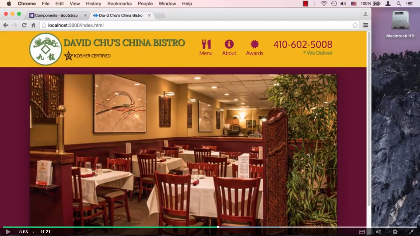
So here's our jumbotron, and what we're doing is basic, we're adding to or overriding some of the properties that the Bootstrap jumbotron class had. So number one is, we're assigning a background URL to be the largest jumbotron image there is, and we obviously, don't want to repeat that. And we're setting it's height because as you know background images don't effect the height of the element, so therefore we need to set the height. And we're giving it some box shadow and something that you should look up how that works. It's very, very simple. And we're giving it a two pixel border so it will stand out a little bit better. So let's save that and go ahead and look in our browser to see how that looks. So here's our jumbotron, and you can see that we have the border and some of the buck shadowing going on around it. And it's looking pretty nice. However, if we squeeze the browser a little bit and it becomes small than the large size, again, the image disappears obviously because we haven't really assigned an image to that size. So we'll go ahead and go to our medium devices only section of our media query. And we'll go ahead and paste another jumbotron image and this one is going to go right here. And here is some pre-baked code that I have, and again the background URL now is going to be 992. That should match the lower bound of this media query. And I'm decreasing the height a little bit as you can see. The box shadows basically the same and the border the same. Now we still need to repeat this because we didn't really factor it out and we didn't put it outside of the media queries. So we need to repeat these parts. But it's not such a big deal I guess in the future. We could pull it out here all together and put it outside of either media query that way they could share it. So let's go back and check if it works. So now we should be by the medium size it should switch to our smaller image. That's good, that's working. But when we get this small again, it's not there. So let's go back to our code editor and we'll go to the small devices. And again, I have pre-baked CSS that I already wrote prior to this lecture, so we'll go ahead and cut and paste that here. And you can see now, I'm using the lower bound jpeg jumbotron that's matching this, and the height again, is a little bit smaller. And the box shadow, and the border again, are the same. So if I save that, and go back to my browser. So now, I have the largest image, this size. A little bit smaller image at this size and yet even smaller image at this size.
And when we get to this size we still need to do some styling but at least you can see that the smaller image is showing up. And every single time this is something that when you obviously go on a real device there's going to be a particular size, that means only one image will download. That's actually a little bit incorrect, because we do have this image that we are always loading which is that small image. And that's really going to not really hurt us too much on the larger device sizes, but when it's on a super small device size which is your regular cell phone, that's the only image that's going to load, because the rest of them aren't going to load at all. They're not even being targeted for that screen size. Okay, so let's go back to the browser and take a look here. And you can see that, when we do squeeze it all the way, even though the image shows up, we aren't really sizing it properly and we're certainly not giving it the right borders. Let's go back to the code editor, and once again I'll go to styles.css and I'll go to the super small here screen size, the extra small screen size, and what I'll do is I will paste some code here that I pre-baked again for this. And it's going to override that jumbotron, I should say add to the jumbotron class. It will set some margins, give it some padding, the box-shadow and at this point it should be pretty much good to go. If I save it and go take a look. Hmm, it's not exactly what I expected. I certainly didn't expect to see these white lines.
So let's figure out why these white lines are showing up. Let's go ahead and right click and inspect element. And we'll go ahead and choose that div, that jumbotron class that we've been styling and let's take a look here. Well, I think I can see what's going on here. We have padding-right and padding-left so let's We take them off right now it's look perfect. Now why isn't our padding, let's go back to our code, we did specify padding 0 but that doesn't seem to take any effect. Let's go back and take a look and if you look closer, you see what's going on? I'll give you a second. Well, it's that good old specificity that's again getting in our way. You see the padding is specified with .container, a class container followed by a class jumbotron. Or a class fluid, container-fluid, followed by a class jumbotron. Well, the problem is, if you look at our specificity, we only have one class, and they define it with two classes, so all we really should be able to have to do is just say container and say now container followed by jumbotron. Save that and go back to the browser and look at that. Now it's actually exactly how we wanted it. In fact it's a probably a good idea to take this container jumbotron combo and actually go through every single place where we specified jumbotron and actually use that specificity so you know we don't get tripped up by this again. Let's go ahead and replace that everywhere, and replace that here as well.
And now, we go back to the browser, we should be good to go. And if we stretch the browser, right, and every single screen size, we see that it's working just fine. As you can see the responsive, the ING responsive class, from bootstrap is letting us now go to the ING tag at this size and letting us stretch the Image back and forth and as we get to a higher size now it's just a background image and therefore it's just going to stay static but keep jumping every time we go to a different screen size. One last thing is we're specifying a couple of properties namely border and box shadow. Every single time that we specify container jumbotron. Well, I think it's probably a waste so let's go ahead and take that out and put it into a style that's outside any media queries. That way we're only going to have to specify it once and not have to specify it every single time for every media query which seems a little bit wasteful. So let's take that out of here. And now that we're outside the media queries let's go ahead and create a class called .container, container.jumbotron
And we'll cut and paste those two properties right here.
And now it should be like that everywhere and that's actually part of the home page.
We save it and we'll go back to the browser and everything should pretty much work as it was before. As jumping through different sizes. As you can see, everything is working, at least, seems to be working just fine. Okay, so our jumbotron is working, and we're ready to move on.
Video Images


0 comments:
Post a Comment