SOURCE: https://www.youtube.com/watch?v=mIlAyAoHc_8
In a previous lecture we saw that there was a bit of a problem with our layout when we went from the wide screen to a little bit more of a medium screen. So let me show you what's going on. So if I go over here and I cross the 1200 pixel break point. This thing jumps and it goes over here. And that kind of looks unseemly. We really want this a little bit higher up. Well, the reason this is happening is because this DIV right here and this DIV they're both floating, and since we're kind of running out of room on this one row, just like any other float element it just gets pushed to the next row. And it's still floated right, so that's why it's still over here and not moving over here. So let's verify that. Let's go ahead and select this right here and that's our header navbar-header. And if we decrease its width, let's say 400, and you can see it jumps over here, right. So since we made this smaller. It jumped over here. Well, let's refresh that for a second. We really don't want to decrease the DIV, the entire DIV. What we really want to do is actually make this logo a little bit smaller. It's kind of a candidate to be made smaller, anyway since we have a smaller screen and we want to make the image a little bit smaller, and also kind of save a little bit of bandwidth as well. So, let's go back to our code editor and I'm located in lecture 33 in the after folder. I'm going to bring up my styles that's CSS and obviously we're up to break point, which means we need to write our own media queries. And I kind of wrote out some of the media queries we're going to need right here and we're going to have a media query for large devices with minimum width of 1200 pixels. And as going to be a medium device with a range of between 992 and 1199. The small one is going to be between 768 and 991 and extra small will be Basically max width is going to be 760 pixels. Now I didn't make these up. I actually took them verbatim from how Bootstrap subdivides and creates it's break points. Okay. So what we're targeting at this point is the medium devices one. And I already have some code that I could just copy and paste over here that will make our logo a little bit smaller. And here it is. So we're targeting our logo image. And we're changing out the background image URL to a different logo. It's a different file. It's restaurant-logo_medium.png. And it's smaller in size. So before I think is was 150 pixels by 150 pixels. And now it's a little bit smaller and the padding perhaps is a little bit smaller as well. This is something you basically have to tweak a little bit yourself. You know there's no point of doing this on screen once it looks good, then you're good to go. So let's go ahead and save that, and let's go look at our browser. And viola, look at that. So now, we're much better shape. We can see that, this thing shrunk, this logo shrunk and therefore it gave us enough room here to have a few buttons. And now if we squeeze it at certain point, at the small break point right here, the logo will completely go away and. This will at this point not fit here anymore and it will slide right under our brand name or the name of the restaurant. And actually this look pretty good some okay with that and not really having to fix that because, this to me it looks nice and compacted. And as we go closer, there's something still needs to be fix but at the medium and the small break point, we're now good to go. So in the large break point, we're also good. You could see the image keep switching sizes at this point so we're good there.
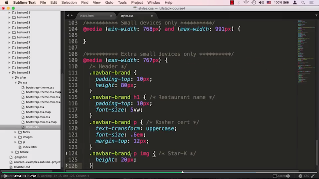
Okay so seems like the only thing we need to start fixing here is when we get all the way to the small screen, David Chu's China Bistro looks pretty good but it's probably too big, and certainly this spill over is not good either. So let's go ahead and go back to the code editor and we'll try to fix that. We'll scroll down to the extra small Device. Let's go back and recheck. We are now below 767 pixels, so we're in the small and the extra-small range. And let me go ahead and cut and paste some code that I pre-baked for this.
Okay. So let me go over this code right now. So first thing is, on the navbar brand, we want to do a couple of things. Number one is, we want the padding to decrease a little bit. I think it was 15 pixels before. We're making it now ten. And also we want to set a concrete height for it. So we don't rely on the whole thing collapsing around it. So we want to. Limited to 80 pixels but at the same time set a concrete height. Number two is the restaurant padding is also going to decrease a little bit, I believe it was larger before. Now it's padding top to be 10 pixels.
And the font size is something we haven't really seen in this type of unit before. It's 5vw. What is vw stand for? Well vw stands for viewport width and one unit, so if you let me create a little note here as one unit of vw, vw is equals to 1% of viewport Width.
And the reason we're using these units is because these units are responsive. In other words as the screen keeps stretching and being squeezed this is going to be, the font size is going to be relative to the screen width. And this is what we want here. And five seems just about right for that. And this is one of those responsive font-size units that has been introduced a few years ago, but at the same time it is very widely supported among just about all the browsers. Next, what we're going to do is, we're going to decrease the font of our Kosher certification that, Kosher cert, and that's just the word, kosher certified. And we're going to keep it all in uppercase. And I believe we probably all ready had this before. And we could check this real quick.
And I see that the rest are. Here on to the navbar-brand p already had the Kosher cert, already had the upper case so if we scroll back down really don't need this anymore we could just take that out so, that's kind of duplicate, and we are also going to give it a smaller margin top. And just to constrain the star K, that star that we saw over there, that star image. We're going to give it a height, so we can actually center that kosher certified with the star image and it will align nicely. So, let's save that and go over to our web browser, and we can see now that the name of the restaurant is Is bigger than before, so now it's filling up a little bit more space, since we removed the logo. And this kosher certified is sitting nicely within the yellow region. So, if we stretch this back out, this should switch back to the previous size of the restaurant name, and give it more content in the header. And as we stretch all the way out It will now show the logo of the restaurant. And obviously as we go beyond the 1200 pixels, the logo of the restaurant is going to become much bigger. And let's go back to our small size. And here's where our small size as you can see, the name of the restaurant is stretching depending on how wide the screen is. Okay so that's it for part one of this lecture. And in part two we're going to turn our attention to styling the drop down menus.


0 comments:
Post a Comment