OK, so let's start building up our restaurant website. And what I have in front of me is a mock up of the site again. And what we're going to start with is building out the header element of our website and you can see it right here. In the top part. OK, so let's go back to the code editor, and actually, before we even start coding, let's go back to our terminal window and start the browser sync, so we can work and at the same time look at the results of our work almost immediately. The first thing we want to do is we want to make sure we're in the right folder. Let's do pwd, the current directory, and you can see I am in the full stack course four examples lecture 30 after folder. And it's important that we're in the after folder, because as you remember, our entire website is going to be sitting in the either after folder or before folder, right? Depending on where, you know, where you start. So let's go ahead and do a recall of our browser sync. And here's our browser sync. And actually there's a first on screen mess up right here. Well, it's not the first, but it's the first one that I'll leave alone without editing it out. Is that this is really not going to work. Let me show you why not. This star part is really not going to work for us. And the reason it's not going to work is if you do an ls, you'll see that we'll going to be actually editing stuff inside the CSS folder. Yeah we're going to edit html file right here in this folder. But we're going to edit the inside of the CSS folder and eventually we'll edit inside a JavaScript folder. So, what we really need, actually, let's do the browser sync again, is we need to tell the browser sync that you should watch out for any folder, not just the one we're in, but any folder within other folders and anything inside those folders. So, just watch out every directory for the entire structure all the way down, and let's go ahead and start that up, and it should bring us to a browser window right here. So if we click index.html we should get our connected to browser sync and here's our maroon background.
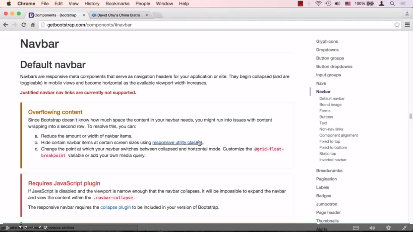
OK, so let's go back to the code editor now, and as you remember there is a semantic HTML5 tag called header. That we can actually use for this and there it is. And now let me quickly cut and paste some of the code that I've prepared and go over it. So the first thing that we're going to do is create our nav bar. Basically, the navigation bar. And this is going to be done by the nav element, and we're going to give it an ID called header nav. And we'll see in a minute why we're going to need that. And we're going to give it some classes that Bootstrap provides for us. And it's going to be two classes. One is navbar. Another one is navbar default. Now Bootstrap does this a lot. It will give you like a base class, and it will give you then a sub class that basically uses the base class, plus add something to it. So there's navbar default, there's navbar invert. There's different classes that really share some of the properties of the navbar, so you should really just get used to that. Let's go ahead and take a look as to what's going on in our browser. And you can see here, now on top, we have this navbar defined. The only couple of problems with it, number one is it's the wrong color. We don't want this color, we want that yellowish color. Number two is if you look closely, you'll see in the corners here that you have this, a rounded border around it. So that's something that we need to kind of put in our mental to do list as what we need to fix. Let's go ahead and take a look at the next inside element of that, its container. The container element is something you should be pretty familiar with, and remember there's two types of containers. There's a container dash fluid, and that's the one that stretches all the way to the edges of the browser. And it has a bit of a padding on both sides, about 15 pixels of padding on both sides. And then there's the regular container that actually changes its width based on the width of the browser. So they're actually not going to stress all the way to the sides of the browser, but will kind of constrain itself to be a little bit closer to the middle. And basically our entire content of our website is going to sit inside of that container or at least be aligned with this container. This is going to be our header container, and we're going to have another one that's going to be for the main content. And the reason we're doing this instead of using container fluid is because our website doesn't have that much information on it. If it doesn't so many different things going on here. So if we were to let the content stretch and reposition itself all the way to the widest point, the width of the browser, this website would look a little bit weird. Therefore we're going to sort of constrain the width of our content to be a particular width and no more, and that way we can control it a little bit easier.
Also notice the other thing is that the div with the container class is sitting inside of the nav element. Well the reason that is is because of that yellow right here that is the background of our header. That is something that we do want to stretch all the way to the edges of the browser, and if we do that, if we set the yellow on the container, that means the yellow is also going to stop where the container stops. Which is going to be really far away from the edges of the browser, at least potentially. So the point is that's kind of a trick, is to first have a nav that you actually define the color on. And then all of your content will actually sit in a container. It'll be much more constrained to kind of the middle of the screen. OK, so speaking of this background color, let's go ahead and go to our styles.css, and define this header nav to be what I want. I already have some code that I'm going to go ahead and copy and paste. And our ID header nav is going to have a background color of this yellowish background color, and we're going to make the border radius, remember the borders were a little bit around it. We're going to make it zero, and I know I haven't really covered border radius, but feel free to go online and actually research how that works. We're not going to use it too much here, but it's not something that's going to take you too long to figure out. And another thing is we want the border to be zero as well. We want it just to be yellow color. So now we're going to save this, go back to our browser, as you can see, the browser sync is going to tell you that it injected the styles of CSS. And now we have a nice yellow background stretching all the way to the width of the browser. And there's no border, so they kind of fuse very nicely together. OK, next, let's go ahead and try to place our logo in the top left of that header element. Let's go to our index.html, and I have some code prepared a little bit here, and let me go over it real quick. So number one is we have new element, new div and it has a class called navbar header. And basically if you look up the Bootstrap documentation, it's kind of a wrapper class that a lot of other classes will depend on being in this position in order to work properly. And there's some padding that's involved, sometimes it floats and sometimes, depending on the size of the screen, it will do other things. Now, it's a good idea to not be scared and actually open bootstrap.css and take a look as to where this navbar header appears and what it's supposed to do. However, obviously most of the time you're not going to be going through bootstrap.css in order to figure out where to put which classes. So how did I know to put navbar header here and wrap some items in it? Well the way I knew it is to go to documentation. So if we look here and go under components because the navbar is a component. And I'll scroll down and click on the navbar right here, and scroll down a little bit more. It gives you a whole bunch of different examples, and it actually will tell you what to use. So here you could see here the brand and toggle group together for better mobile display. Well, navbar header is something that is grouping this drop down, which we actually, we haven't talked about yet. And it's grouping a brand, which is something we're about to work on, and brand is part of your branding name, which is what it says here and the logo of the company, so it's part of the same thing. So it's telling you basically that this is how you should do it if you want better mobile display, and that's basically how we arrived at having this content inside with div with the class navbar header. OK, so moving on to implementing our logo. Well, we're going to surround our logo with the A element, so the logo itself will become clickable. And the logo is going to be nothing more than a div with an ID called logo image, because we're going to insert it as a background image in there. And we'll give it an alt tag logo image, so the screen readers will know what that is. OK, so at this point we're really not going to see anything, simply because we don't have any kind of image pointing to this tag yet. So let's go to our styles.css and I'll cut and paste some code that I've prepared here. And we'll create this logo image. And the logo image is that ID that we just gave to the div. And the way we're going to have the image is we're going to have a background URL, which is going to point our images folder, restaurant logo large .png and we're going to make it that it's a no repeat. And I also know how large the image is, I know it's 150 pixels by 150 pixels and I need to style my div to be that wide, because otherwise the image is going to get clipped. And I gave it some nice margins around. So let's go ahead and save that and save the index.html, and we'll go to our browser. We'll take a look as to what we have over here. So there we go. There's our image right there. OK, so this is then end of Part One of the lecture. And in Part Two, we're going to go ahead and insert the name of the restaurant and position and style it nicely to the right of the logo.
Video Images


0 comments:
Post a Comment