SOURCE: https://www.youtube.com/watch?v=vcaelbK05II
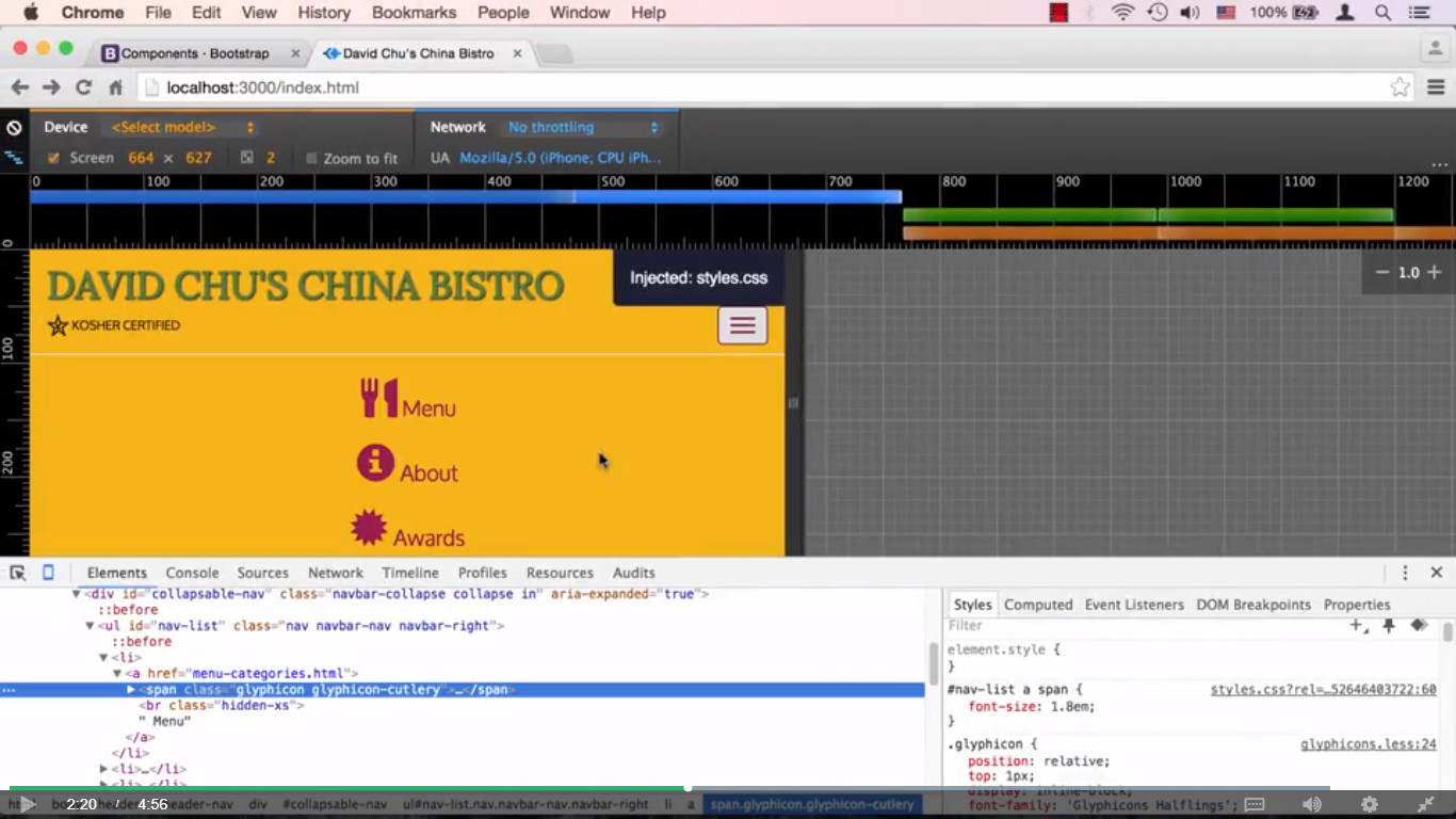
In part one of this lecture, we concentrated on styling the menu when the browser was in fullscreen desktop mode. In this lecture, we're going to talk about styling the menus when they're in the drop down, mobile mode. Let's take a look at our collapsed menu over here. And you can see there's a bit of a problem. The glyph icon looks way too big, especially comparatively to the menu. So what we really want, especially given that this is a font icon, is for both of these things, the font icon and the word menu and the text over here to really be the same font size. First, let's go ahead and investigate why there are indeed two different font sizes. Let's right-click on this menu text right here and click Inspect. So here we are on that a element, that link element. Let's go and click on the text itself. Let's go ahead and try to scroll and find the first time that font size is mentioned right here. So it should be right around here somewhere. And there it is. The first time font size is being mentioned, and it's not crossed out, which means it is applicable to our element right now. It's coming from styles.css. That's our file. And it's going for 16 pixels. So this menu item right here, the menu text, I should say, is actually 16 pixels. Well, what about our glyph icon? The glyph icon is really just a span above it, or inside this a href. So let's go ahead and click on the glyph icon. And we'll scroll all the way up. And let's take a look. The glyph icon actually is getting its sizing from #navlist a followed by a followed by span, and it's also coming from styles.css. Well, we kind of want to override that. We want to override that and we want to override and make our menu just a little bit bigger. It's a little bit too small. Let's go ahead and go to our code editor. And I already have a style here that we can apply, and I'll go ahead and cut and paste it right here. And this style will take that 16 pixels that we're inheriting for that a element from the body element that's been defined, and it's going to bump it up just a little bit. So we're bumping it up about 20%, so 1.2ems. So if we save that right now, go back to our browser, and you can see that the menu became a little bit bigger. Well, so did the glyph icon, obviously, because the glyph icon is sitting inside, right now it's a 1.8em, well, 1.8em, it became 1.8em of whatever the menu was, because the menu is kind of sitting inside of the a element which encompasses this glyph icon. So let's go ahead and change that. And I since want the glyph icon to be exactly the same size as the menu item, well, we just then want to inherit whatever the menu item's font size is onto the glyph icon. Well, the way to do that is to make sure that this span has 1em as its font size. In other words, I don't want you to change anything from whatever I'm inheriting. I want you to be 100% of whatever it is that I'm inheriting. And I should be inheriting at this point the font size from the a element. Well, the problem is, at the moment I'm actually overriding it directly with having a, and I don't want to, obviously, put anything new there, but I'm overriding right now with the ID followed by an element and followed by another element. Well, we know all about specificity in CSS, so we could override that very easily by just specifying that. Let's copy that. And so that's ID followed by an element followed by another element, so that would override that. And all we need to do is just say font-size: 1em. And that is basically instructing the browser to override whatever font size this specific selector had and override it with 1em, which will in turn take whatever its parent element had and keep it exactly the same. Well, its parent element had 16 pixels times 1.2, which is about 19 something, 19 something pixels or 19.2 or so. And it will keep it right here. So if we save this and go back to our browser, we should now see that they're both looking pretty good and just about the same. One last thing here is, they look way too close, and I think we need to put a margin on one of them. Well, for example, we could put them, on the actual glyph icon, we could put margin right. I would say about five pixels or so. So let's go back here and give it a margin-right 5 pixels. We'll save that, go back to the browser.
And now the drop down menu is looking much better, and it seems like we're done with the menu, at least for this stage of the website development.
Video Images


0 comments:
Post a Comment